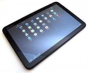
Julie got the first look at the Xoom, and did a couple of excellent posts on it including a First Looks and the full review. If you are wanting the complete run down on the tablet I highly recommend these posts. And, as always on The Gadgeteer, the comments are full of great additions as well.
Julie may have received it first, but I got to spend a long time with mine, so I wanted to share my observations. Also, she did such an excellent job with the nuts and bolts, I will focus on more general observations.
The Xoom is certainly not the first tablet. There have been a few based on the Android OS that even predate the iPad, but it was the first that ran Honeycomb. This is designed from the ground up to be a tablet OS. If you are used to Android, it’s not a big change, but there are some adjustments.
There are no buttons on the front. The power button is on the back, and a rocker volume button is on the side. I like buttons, but I was all right with it after a while. You do have a toolbar visible at the bottom of every screen:
![]()
The first icon takes you back, the second icon takes you to the home screen and the third displays the recent applications. If the current page of the application has a menu, a grid icon can be touched to display the menu. On the right side you have icons for any notifications. On this screen the first is the debugging notice (I use that to grab screens), the second tells me Words With Friends is ready for my next move, then you have the current time, signal strength and battery level.
If you tap the settings, you can see more information:
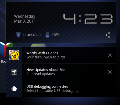
Tapping the settings icon (sliders underneath the time) gives you access to common settings.
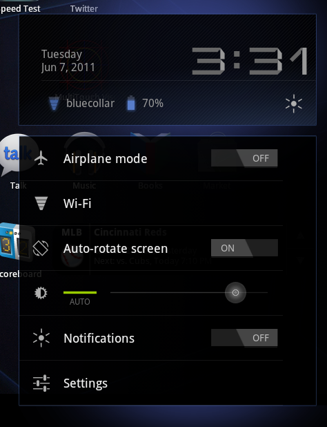
So two taps takes you to a screen to control Airplane Mode, access Wireless settings, turn on/off auto-rotate, set brightness, turn off notifications and finally get to all the Settings.
The ability to turn off notifications is a great feature. Especially if you are using it as a reader. Late at night, my wife can deal with the glow of light, but is not a fan of the occasional alert tones.
Room to Breathe
Apps designed to take advantage of the new real estate on the display really shine. Of course Gmail embraces it:
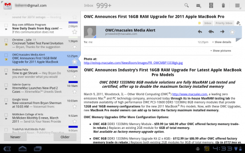
I really like the layout in landscape. I have my inbox on the left, and the contents of the e-mail on the right.
One of the first applications designed for tablets was the CNN app. Once again, a nice use of the layout:

Battery Life
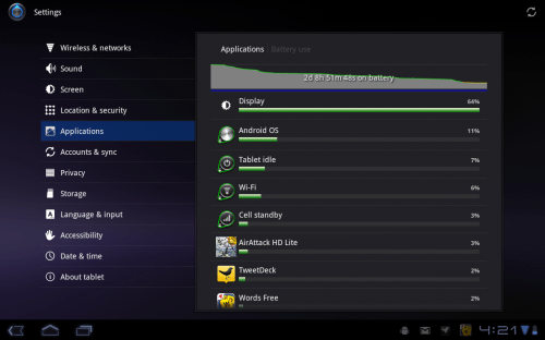
I thought the battery life was good. I mean, after all, I need to sleep sometime. Even while playing some intensive games (like AirAttack HD) I was at 2-1/3 days before wanting to recharge:
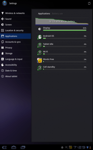
Reading actually took the most out of my battery, since the screen was on the whole time. This was one of the worse results:
One disappointing thing about the Xoom is you cannot charge via USB. This is a big deal for me, I have far too many adapters to track as it is. However, I think this is the current state of tablets. I assume the batteries are too big to efficiently charge via USB. I just wish it was an option for when you find yourself without the adapter.
The Home Pages
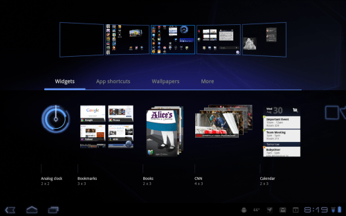
If you are used to iOS, you may be confused by the home screens in Android. With Honeycomb, when you download an application from the market it does add it to a page for you (unlike previous Android releases). But the icons you see on pages are just shortcuts, not the apps. Managing this is very easy, and I am still a widget fan:
Form Factor
You know what I want? A tiny tablet that will fit in my change pocket and expand to give me a 17″ display. Yeah, we are not there yet. To me this is always about tradeoffs. I love my Sony Reader that conveniently fits into my coat and jacket pocket. The Xoom won’t. But the screen real estate is great. I still would like to try a smaller tablet on for size. I am just not convinced I want one this big. It is also heavy. However, it has a great display and a sturdy feel. I am a big fan of the rubberized finish, and have become accustomed to the size. I’ve now borrowed and read most of the first three books of the the Songs of Ice and Fire series on the Xoom. So I guess that speaks to the form factor issue. However, since returning it I have returned to my PRS-700 Sony Reader, and have been enjoying its weight, size and portability. I am still a fan of e-ink for reading, but the display on the Xoom was very acceptable for reading.
Half-Baked?
One of the complaints about the Xoom is that it was rushed to market, and is half-baked. It does appear rushed, but I think it is more like 7/8ths baked. Yeah, I kind of made that up. But still, it would be nice if it shipped with 4G and the SD card enabled, however the fact that it can be upgraded to 4G and the SD Card slot will be activated with an update makes it less of a big deal for me. It did not ship with Flash capability, but that is already fixed. And 4G and SD card capability will never be coming to the iPad or iPad2.
Bottom Line
Is it worth it? Will I buy one? The answer to both is maybe. I like it more than I expected to. It is a great tool for surfing the web, working on e-mail, using twitter and reading. Do I need it? No. Do I want it? Yes. The issue to me is the cost. If you can justify the purchase I think it is a great choice in the tablet space. If I had the money, and had to choose one now, I would be getting this. Am I saying it is better than the iPad? No. I haven’t used an iPad for any length of time, and trying to label one “best” is pointless to me. It’s just a better device for me than the iPad.